Vacation Rental Logo Design

    A logo is the first thing a traveler trusts. Or doesn't.

    Before a word of copy is read, the mark on the corner of a listing has already told a guest whether this is a real business or a weekend hobby. Twenty years designing vacation rental logos has taught us the ones that work all do the same four things.

    Read the branding philosophy
    Jay William · Founder

    Twenty years of watching bad marks lose real bookings.

    I've designed vacation rental logos since 2005. Coastal marks. Mountain marks. Resort crests. Property management identities. Family villa monograms. Enough to know one thing: the logo is the first trust signal a traveler reads, and most owners never take it seriously.

    They treat it like decoration. Something a cousin's neighbor can knock out on Fiverr for fifty dollars. Then they wonder why the direct-booking website they built on top of it never converts. The site isn't the problem. The foundation is.

    A logo doesn't have to be complicated. It has to work. In a listing thumbnail. Embossed on a welcome book. On a small metal sign at a gate. In a browser tab. On an owner presentation where you're competing for a million-dollar house. If it works there, it works anywhere.

    What a vacation rental logo has to do

    Four traits. Every working mark has all four.

    Legible at thumbnail size

    The first place a guest sees your logo is a listing grid, a map pin, or a browser tab — usually under 32 pixels. If the mark blurs into a smudge, the trust signal never fires.

    Distinct against look-alikes

    Ten thousand rentals use the same waves and palm silhouette. A working mark uses something specific to your property or place — a landmark, a shape, a monogram — that nobody else in your market is using.

    Tied to place and story

    The Jupiter lighthouse. The Ocean City wave. The Blue Water Cove seahorse. The mark carries a piece of the property's real geography and story into every place it shows up.

    Functional across every surface

    Signage, keys, welcome books, printed guides, embroidered towels, a favicon, a mobile browser tab, an Instagram avatar, an email footer. A working mark has variants that hold up on all of them.

    Logo vs. brand identity

    The logo is the tip. The identity is the iceberg.

    A logo is one mark. A brand identity is the system around it — primary and secondary marks, a monogram for tight spaces, a wordmark for wide ones, a color palette, typography, imagery direction, and the rules that keep it consistent across every guest touchpoint.

    When we design a logo, we design the identity with it. Because the moment the mark leaves the file and hits the real world — signage, print, a favicon, an Instagram avatar — it needs variants that hold up. Without an identity behind it, a logo breaks the first time it has to scale. That's the same argument that lives at the center of our vacation rental branding guide, and it's the reason we don't take on logo work in isolation from the website that will carry it.

    A $50 template mark costs more than it saves. Every downstream decision — the site, the signage, the print pieces, the paid ads — has to fight a weak foundation. You pay for the discount later, in bookings that don't happen and owners who don't sign.

    Who the mark has to earn trust with

    A property manager's logo has two audiences. Most designers only think about one.

    Travelers deciding whether to book

    A logo is the first trust signal a traveler reads — before a word of copy. It tells them within a fraction of a second whether this is a real, cared-for business or a listing thrown together over a weekend. Get it wrong and the rest of the site is doing damage control.

    Owners deciding who to hand their asset to

    For property managers, the mark has a second audience. An owner about to hand you a million-dollar house reads your logo the same way they read a bank's — as a signal of whether you're serious. A weak mark loses owner meetings you'll never know you were in.

    Marks we've made

    Three logos, three real properties, one philosophy.

    No stock examples. No competitor logos. Every mark below is Villa Marketers work for a real client, described honestly. More of the same lives in the portfolio.

    Ocean City Vacation Homes logo — vacation rental brand mark designed by Villa Marketers
    OC monogram · ocean wave

    Ocean City Vacation Homes

    An interlocking OC monogram wrapped in an ocean wave. The monogram carries the destination in two letters — the wave carries the coastline the guests are actually coming for. It reads clean at 24 pixels and holds up embossed on a welcome book.

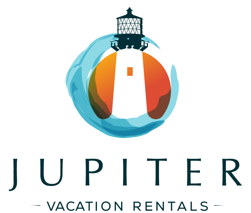
    Jupiter Vacation Rentals logo — vacation rental brand mark designed by Villa Marketers
    Jupiter Lighthouse · turquoise waves

    Jupiter Vacation Rentals

    A rendered Jupiter Lighthouse, sun, and turquoise waves. The lighthouse is the actual landmark of Jupiter, Florida — locals recognize it instantly, and travelers googling the area associate it with the place. For a property management company, the same lighthouse doubles as a guidance metaphor for the owners choosing who to work with.

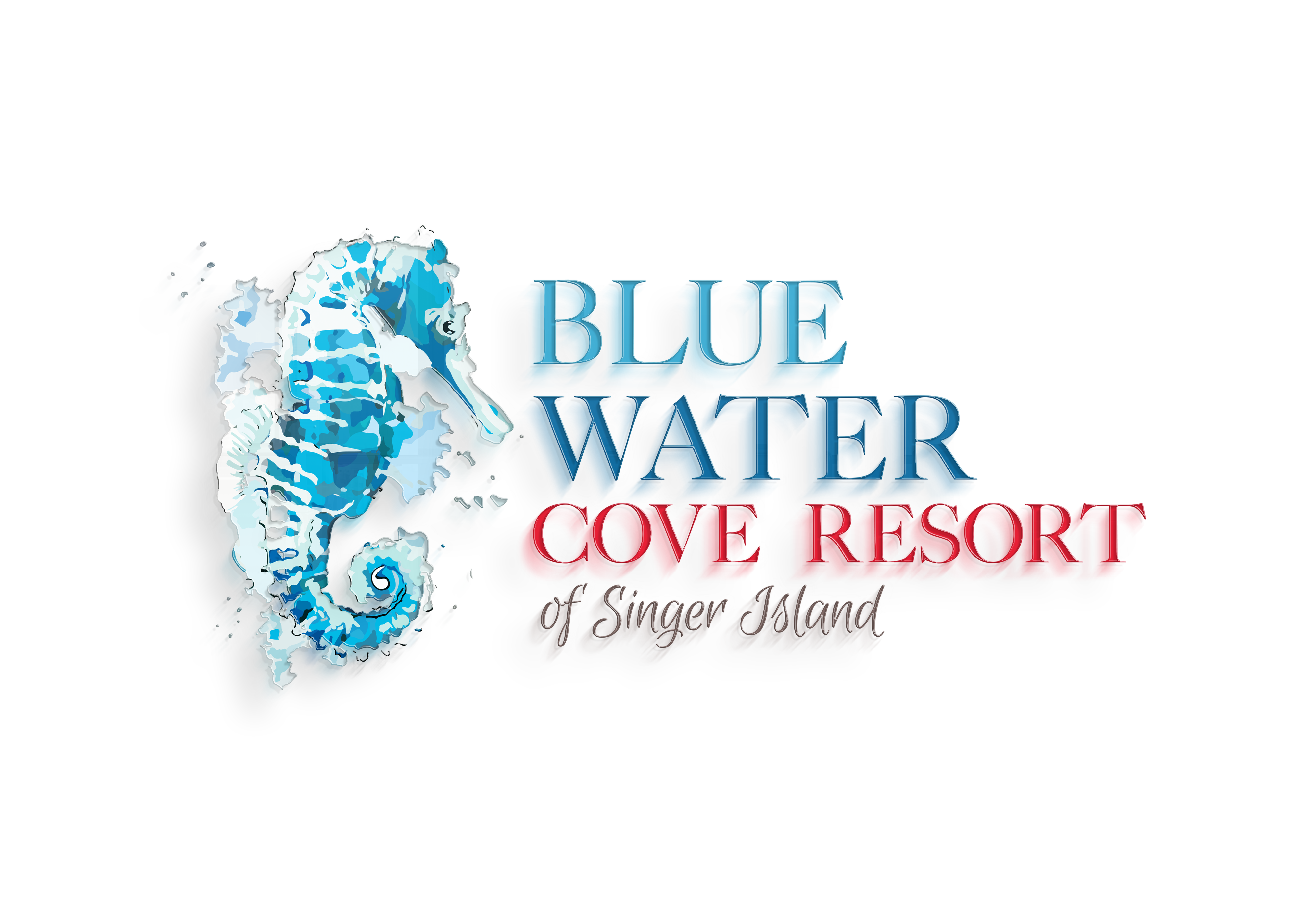
    Blue Water Cove Resort logo — vacation rental brand mark designed by Villa Marketers
    Seahorse mark · Singer Island

    Blue Water Cove Resort

    A regal seahorse centered in aqua and teal — a reference to the snorkeling and diving grounds a hundred yards off the resort's beach. Custom typography, organic lines, one mark that separates a four-condo boutique resort from every generic condo complex on Singer Island.

    Ten more marks · ten more decisions

    The reasoning behind ten Villa Marketers client logos.

    2016 and earlier

    These ten go back years — some over a decade. Design conventions move; the thinking behind a mark doesn't. Read them as a record of decisions across a working career, not a portfolio of this quarter's output. The visual conventions aged. The decisions behind them didn't.

    Nashville, Tennessee

    Nashville Travels

    Suitcase-guitar mark · country wordmark

    Music City needed a mark that carried both halves of the name. We fused a suitcase and a guitar into one silhouette — travel and Nashville, in a single shape. Country-styled wordmark. Two outlaw stars for anchor points. One idea, read in a second.

    Breckenridge, Colorado

    Breckenridge Mountain Rentals

    Classic crest · cabin, forest, mountains, snow · trust blue

    A startup that needed to feel established on day one. Owner Troy chose the strongest-sounding name from the shortlist, and the mark followed suit — a classic crest with forest, mountains, a dusting of snow, and a cabin planted in the center. Blue on purpose. Same reason banks use it — it reads as trust before the eye reaches the wordmark.

    Old Orchard Beach & Lake Arrowhead, Maine

    Maine By The Water

    Umbrella brand · sandals, beach chair, hooked fish, kayak

    Owner Valancy came in with two Maine rentals in two very different parts of the state. The temptation was to brand them separately. The right move was to find what they had in common and put an umbrella over both. One is fifty steps from Old Orchard's white sand. The other is fifty feet from Lake Arrowhead. Water was the through-line — so was the name. The mark carries beach objects on one side and a hooked fish and kayak on the other, so a guest reads the promise before they read the copy.

    Ixtapa, Mexico

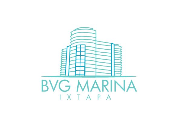
    BVG Marina

    Rendered building · aqua windows
    BVG Marina Ixtapa logo — single-weight line drawing of the marina building with aqua window accents

    Not clipart. The mark is drawn from how the actual building looks from the water — including the aqua windows the resort is known for up and down the Ixtapa coastline. Owner-side site by Stacy, built to help fellow BVG owners market their rentals independently. Rendering the real building means the website and the resort share a silhouette in a traveler's memory. Cheap association trick. Works.

    Atenas, Costa Rica

    Atenas Vacation Villas

    Toucan, butterfly, hummingbird · destination locked in

    Owners Dianne and Steve Doughty sent over Costa Rica references — toucans, butterflies, hummingbirds — and asked if we could get all three into one mark. We did. Dianne's line when she saw it: it felt like Costa Rica. She also insisted the destination live inside the logo, because she'd seen too many rental sites where a guest can't tell what country they're looking at. The mark names the place. That's not decoration — that's a booking decision made faster.

    Pigeon Forge & Gatlinburg, Tennessee

    Closer To Heaven Cabins

    Bridge motif · mountain vista

    The name is the promise. The mark had to render it. A bridge motif tied to a mountain vista — the visual of being lifted above the noise, closer to the view the cabins actually have. In a market with thousands of look-alike cabin brands, a mark this specific helped drive hundreds of direct inquiries off the owners' own site.

    Koh Tao, Thailand

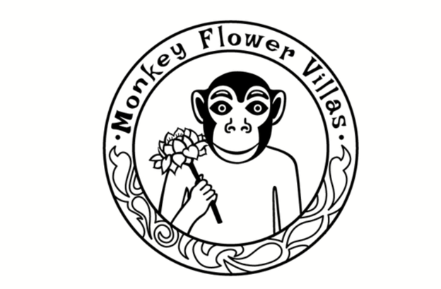
    Monkey Flower Villas

    Owner sketch · tribal linework · black and white
    Monkey Flower Villas Koh Tao logo — hand-drawn tribal linework of a monkey and flower motif in black and white

    Owner Lincoln Kroll's nickname in Thailand is Ling — monkey. His guests can climb onto the villa roof and jump into the pool. This is a rebel brand, and it wanted a rebel mark. We built the logo from Lincoln's own sketch, kept it black and white, kept the tribal linework. Different by design. That's the point — a memorable brand is one nobody else in the market can copy without giving themselves away.

    Solterra Resort, Davenport, Florida

    Solterra Sunset

    Rendered property · large sun · palm silhouette

    A six-bedroom home near Disney inside the Solterra Resort community. Owner Oliver Ballhatchet wanted a mark rendered from the actual property — with a large sun to carry the Sunset half of the name and a palm to set the scene. The brand name doubles as a search asset: Solterra keeps the property tied to the resort travelers are already Googling by name.

    Nationwide · Wyndham, Marriott and 100+ resorts

    The Timeshare Brokers

    Refined rebrand · cleaner condensed wordmark

    A rebrand with a rule attached: do not throw away the equity in the old mark. This is a company that buys, sells, and rents timeshares at scale — the old logo was recognized. So we condensed it, cleaned the geometry, and let it grow up without breaking the recognition. Rebrand when the revenue and the perception will move. Not because you're bored of the old one.

    Curaçao

    Villa Surrender

    Rendered villa · white surrender flag · Caribbean palette

    Owner Janet has a flagpole on the grounds and invites arriving guests to raise a white flag — surrender their worries to the villa. The mark is a rendered version of the actual house: the flat roof, the rounded openings, the cliff at the edge of the sea, pink Curaçao skies, Caribbean blues below. It's the ritual, drawn. A guest sees the mark and already knows what the stay is going to feel like.
    Frequently asked questions

    Vacation rental logo design, straight answers.

    A good vacation rental logo is legible at thumbnail size in a listing grid, distinct from the look-alike competition, tied to the property's real place and story, and functional across signage, keys, welcome books, print, favicons, and a mobile browser tab. If it fails at any one of those, it's a decoration — not a mark.

    Ready for a mark that earns the booking?

    Twenty years of vacation rental logo design. Real property references. Marks that hold up at 24 pixels and on a metal sign at the gate. Start with a strategy call and we'll scope the work honestly.